My IAMPETH Certificate of Proficiency In Engrosser's Script Application - 2022
I share my personal experience applying for the Certificate of Proficiency in Engrosser's Script under the IAMPETH Certificate Program in 2022.
Please note the videos and this article encompass my personal experience only.
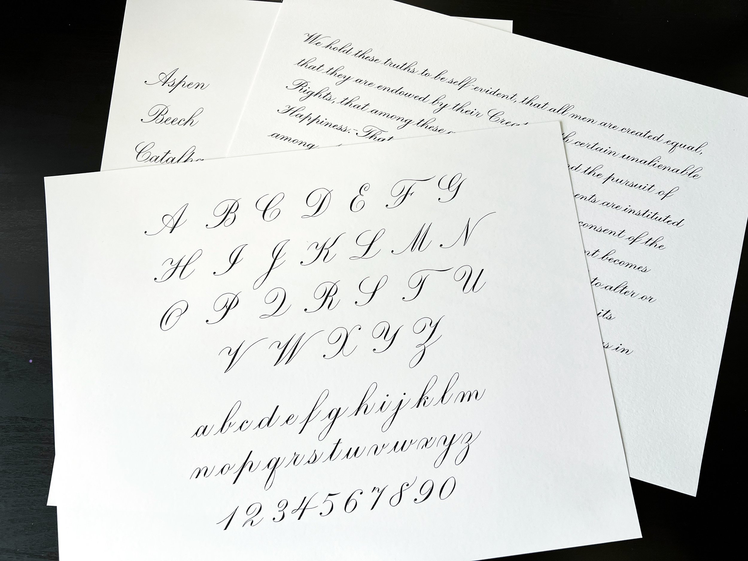
Part 1: I show my finalized samples and talk about my struggles and the materials I used
Part 2: A quick video showing how I packed my samples in a mailing tube
Part 3: I got my results! This video shows my candid reaction. I also show my scores and the feedback I got from the judges.
IMPORTANT:
IAMPETH changes some of the required text every year, so make sure to read the current year’s requirements thoroughly.
All official details about the program can be found here.
2022 marked my third year as an IAMPETH member which meant I was eligible to apply for the first level in their Certificate Program. This was one of my biggest calligraphy goals to achieve that year and I’m so happy to report that I did it! I successfully passed and received the Certificate of Proficiency in Engrosser’s Script in June 2023.
I recorded these three videos to document my application, and while I mostly just talk and didn’t record my live writing, I hope you find the details useful. I certainly wished there was more relatable info like this while I was doing the project!
How I divided The months
The deadline for shipping your application is October 31st. IAMPETH released the actual requirements in the beginning of September, which meant I only had about two months to draft and finalize my samples. I wanted to be more prepared so I started looking into it a month early - in August. I also didn’t want to send it out on the very last day so I finalized all the pieces in the middle of October.
Things you could do ahead of September
Study the reference.
For Engrosser’s Script, the Zanerian Manual has remained the standard in the past few years and I don’t see that changing any time soon. Print the pages out. Print the letters out BIG. Draw guidelines on them to understand the proportions. Read the text instructions.
Identify areas that require more study and practice for you. Use the time to practice your script.
For me, I knew that my majuscules needed work, as well as my loops and their accent shades. I also rarely wrote numbers when doing calligraphy so I knew I had to spend extra time studying them.
There are three samples required for the Certificate of Proficiency. Use the previous year’s sample requirements as inspiration for practice. (You’ll have to be an IAMPETH member to view it on their website.)
The alphabet exemplar seems to be a constant requirement each year and is therefore a safe bet to practice. Not sure how variable the x-heights and paper size get every year (in 2022 it was ¼ inch on 11 x 14 paper) but you can certainly start thinking about how to lay the letters out on paper, and adjust it to the proper size later. You’ll need to demonstrate majuscules, minuscules, and numbers.
The list of names consists of 26 names from A-Z, with each first letter capitalized. The exact words get changed every year but since it’s always going to start from capital A to capital Z, you can start practicing how to align these first letters on the page. Note: in 2022, the x-height required was ⅛ inch.
The third sample used to be three pangrams, but got changed to a text block in 2022. There’s no telling what it could be in the upcoming years, but I think it’s a good idea to practice either last year’s text or any kind of quote in the x-height that the previous year’s sample was on, which is the smallest x-height of the three samples. I found it quite a challenge to write in the 3/16 inch x-height!
Things to do once the requirements are out (SEPTEMBER)
Gather the materials. Test your paper, ink, and nib combination.
I got overzealous with this one and bought the previous year’s required paper weight before the current year’s requirements were out. The 11x14 size remained the same but the weight however got changed from 60 pounds minimum to 90 pounds and I only noticed after I’ve already produced the name list sample!
The paper needs to either be white or cream colored. I used Fabriano Bristol Smooth and Fabriano Bristol Vellum which were both at 100 lbs. I suggest choosing smooth papers over textured ones as it’s easier to make quality hairlines with tall x-heights on a smooth paper. It’s imperative of course that you test everything out.
They required the ink to be black. Initially I planned to use Moon Palace Sumi Ink, but I didn’t get fine hairlines with my bottle. I decided to go for an iron gall ink. I had Fox and Quills Red Wine with me and I tested it on my chosen brand of paper to make sure it returned black on the page after drying.
I switched from Hunt 101 to Hunt 22b and then finally settled on Nikko G because it was the best nib that showed great hairlines and a good shade control on the paper that I used. Take into account that you will be working with varying x-heights and some nibs are more flexible than others. For example, I don’t recommend using a Hunt 101 on the 3/16 inch x-height. There are other stiffer nibs that are better suited for creating delicate lines on that small an x-height. Also, don’t be stingy on replacing your nib the moment they feel scratchy. You run the risk of ruining the quality of your piece if your nib suddenly catches on paper, drags ink or splatters it around.
Decide how you will handle the x-height measurements. Additional materials needed: ruler (in 8ths of inches), mechanical pencil (0.3mm HB lead), light pad, guide sheets from lanquach.com.
I was a bit stubborn in the beginning, insisting on having the guidelines penciled right on the page. I personally prefer practicing on paper with the guidelines on them, rather than using a light pad, because it helps me with hitting the baseline and top lines, and getting the slant more precisely. The huge disadvantage is that it takes a lot of time, effort, and attention to pencil it on the paper. You will have to erase it after the ink has dried too, so make sure that if you go this route, that you use an easy-erase kind of paper and a light and thin pencil lead (HB, 0.3mm lead). Some of my biggest frustrations with this method are that a) I encountered inaccurate rulers where the space on one end is bigger than the other end, b) when you’re not paying attention it can have a domino effect - you make one uneven guideline and the rest of the spacing will be wrong, c) when I make a mistake on the page, I would have to re-rule all over again.
You can choose to pencil in the words to help gauge the spacing and to plan the line breaks. It also helps in avoiding spelling, capitalization, and punctuation mistakes. I personally only penciled a letter directly on the page for the text block sample, every time there is a capital letter in the next word, so that I can make sure the spacing looks right and not disrupted. I think penciling the whole text block is unnecessary because you can’t really accurately account for the shades you’re going to make. For the name list, I also penciled in the first letter to make sure I have everything left-aligned.
I highly recommend that you print guide sheets from lanquach.com. You can use them for practicing and for placing them underneath your piece and on top of a light pad. They have presets for the x-heights required in the IAMPETH certificate application. If you’re like me whose printer can’t print anything bigger than letter size paper, you can edit their guide sheet settings to print to the size and orientation you need. I printed the guide sheets off in landscape and letter size.
I eventually gave in and used a light pad. At first I really didn’t want to because even though my light pad was thin, I could still feel the difference in my writing when I’m using it because my arm would be slightly raised from the table. I also found that my eyes get tired more easily when the light source is coming from underneath my paper versus from on top. What I did was to layer it this way: light pad + guide sheet + blank paper, or light pad + guide sheet + draft + blank paper. It helps having a draft underneath to trace from when you need it, or to assist with spacing and layout.
Get the details of what to write. Pay attention to the spelling, punctuation, and capitalization.
Since I knew my majuscules weren’t super polished, I made a list of which capital letters were used in the text block sample and made sure to spend extra time practicing them.
I also made the decision to use a simpler version of the comma (press and release) instead of the fancier-looking one (dot and curve) because I am able to do it more consistently in that style.
Don’t be afraid to start! (And start early!)
It took me some courage to draft on the 11x14 paper size. I initially limited myself to practicing on my regular guide sheets because it was just so daunting for me to start! Don’t be afraid to “waste” paper. Each draft you scrap is not a waste. In my experience, the second draft is better than the first, the third better than the second, and so on.
Self-assess. Write down the things you struggled with. You get better with each try as long as you pay attention. Compare your work with the exemplars in the Zanerian Manual.
Avoid cramming and start early so you have the allowance to draft and redraft when you’re not happy with the result. You will need to score 18 out of 20 for each of the five criteria for judgment.
To make it less daunting, you can draft it pencil first and not put pressure on getting it right the first time. You can first focus on allotting the proper margins and using negative spaces in a pleasing way. Plan the interlinear spacing to make sure your loops don’t collide across consecutive lines. Decide on the alignment of your words or lines as well.
Keep the five criteria in mind. Keep the reference near you always.
The criteria for judgment are: Letter Form, Slant of Letters, Weight of Shades, Uniformity, and Page Layout & Use of Space.
Make sure you’re not doing letter variations that are NOT in the Zanerian Manual (e.g. there are several versions of the lowercase r, x, k, f out there, make sure the one you are using is in the book).
Other details to pay attention to:
Pay attention to the spacing between words, before and after commas, and before and after capital letters.
Pay attention to where your hairlines meet the shades (which letters have the entrance stroke reaching up to the waistline, which ones reach only halfway to the waistline).
My mistakes during drafting stage/things I would have done differently
Using the wrong weight of paper. Make sure to read the requirements thoroughly before starting!
Using a ruler that was inaccurate and uneven. Cross check your measurements or your penciled-in lines against a printed out guide sheet.
Refusing to use a light pad in the beginning. It was such a time-saver later! Use a combination of light pad, guide sheet, and an initial draft under your page.
Not using an initial “model” draft right away. It helps to have a draft where layout and centering is important (e.g. the alphabet exemplar).
I ruined a piece by using a ruler to cross my t’s when the drink hasn’t fully dried yet.
Not guarding the paper against the oils and sweat of my hand. You need to use an extra sheet of paper in between, sometimes the ink does funny things on the page like not following the scoring made by the tines of the nib and going over, or not adhering to the paper at all.
Packing it up: Mailing Tube, Bubble Wrap, Scotch Tape
I inserted blank papers in between my samples and rolled them up with my application form in the middle. I also had my return address labels inserted there as instructed. I then wrapped it all in bubble wrap before putting it inside a mailing tube. The tube I had was longer than my paper so I put scrap bubble wrap on both ends of the tube. After securing the cap, I taped both ends with scotch tape a few times.
I would do it differently the next time around. I would just use a flat envelope. I’d insert it in a plastic slip to protect it from getting wet. And I’d then declare it as “artwork” next time. See below why.
SENDING THE PACKAGE: Timeline
October 16, 2022 - finalized all three samples
October 22, 2022 - mailed via FedEx
October 26, 2022 - arrived in Nashville, TN
December 7, 2022 - customs cleared in Memphis, TN
December 8, 2022 - sent back to Nashville and delivered
My package got stuck in customs for seven weeks!
I sent it through a FedEx retailer near me. They asked if the contents were “documents”, and I, not knowing that there were more specific options, said “Yes”. As a result, my package got held up in customs. They suspected it wasn’t just documents because I had used a mailing tube. I called FedEx again and again to explain and describe what was inside but their action on it was really slow going. The trace agent later on advised me that I should’ve declared it as “artwork” instead of “documents”.
When it finally got delivered, the package was mishandled! It arrived wet and a little bit flattened - I complained to FedEx and I did get my money back but imagine the horror I felt at seeing the photos, thinking that all my hard work had been ruined. Thankfully though, my samples were intact. They were flattened a little bit but they were dry. I’m really glad I wrapped them securely enough.
Receiving the results: TIMELINE
May 25, 2023 - judges’ deliberation/scoring
June 5, 2023 - results mailed back via FedEx
June 14, 2023 - received with a certificate attached
I did it!
I passed! The package contained a cover letter, the judges’ scores and comments, including a couple of pages where they demonstrated what they meant in their feedback. They also enclosed a copy of the Engrosser’s Script section of the Zanerian Manual. My samples were returned with penciled marks on them together with a Certificate of Proficiency signed by the current IAMPETH President.
Judges’ Comments and Critique
I found it really helpful that the judges included a sample of their own to refer to while reading their comments. That feels like going the extra mile and I really appreciated they took the time to demonstrate what they meant.
My deductions came from the Letter Form criteria. I lost one point each on the alphabet and text block samples, and two points on the name list sample. The usual suspects are:
The second shade of my capital H was too straight. This part needs to have a subtle curve (almost to look like a C).
The entrance stroke to my upper looped letters should reach up to the waistline but I didn’t pay enough attention and care to preserve them. I had quite a few where the entrance stroke got overlapped by the succeeding shade and therefore only looked like it reached only halfway through the x-height, and the negative triangular space underneath was smaller than it should have been.
A couple other notable mistakes I made were:
The loop of my capital J was too large in the alphabet sample.
The entrance stroke of the lowercase u in Juniper reached up to the waistline when it should have stopped midway per the judges. I attribute this mistake to me not having the main shades on the same slant.
A bonus suggestion was made by the judge to decrease the vertical space in between the lines of my text block, as per how Lupfer had written with in the past. The judge didn’t provide a reference but I imagine you can find it in the Zanerian Manual. I’m still pretty happy though with my interlinear spacing, I had just wanted to completely eliminate the risk of loops colliding with each other.
What’s next?
I can apply for the Certificate of Excellence next, which requires me to send one sample - my own written certificate. The exact words, x-heights, and paper requirements are yet to be announced as of writing this in August 2023 but I’m very excited to tackle this next level.
I am also eligible to apply for a Certificate of Proficiency in a second hand/script. I was thinking of Spencerian Script but I really need more time to study and practice that one. So this year I think taking on one challenge is enough.
Final thoughts
For me personally, this has been quite a challenge, not only on the writing level but also on the emotional level. I set high standards for myself, and why wouldn’t I - the minimum score was 18 out of 20 per criteria! As a result, with each small mistake, I would scrap and try again. I did around eight iterations on the alphabet and name list samples, and five on the text block. It gets emotionally taxing to do it again and again, to subject yourself to feeling like what you produce (and in your mind, you) are not good enough!
On the positive side, you DO get better with each try. You learn from your mistakes and you learn to laugh away the frustrations that arise along the way. You learn to be more kind and patient with yourself. You learn to be brave by putting yourself and your work out there to be judged.
I am thankful for this program because it is giving me a yearly goal to tick off, a yearly project to look forward to accomplishing. It does feel awesome to have that validation (my grade-conscious self was so smug when I saw my scores). It is great to have a certificate under your belt from a renowned and respected organization, but also, remind yourself that your self-worth is never defined by a piece of paper.
My affirmations during the process
You are good enough as you are right now. This is where you’re meant to be. This is just a snapshot of your work at this point in time.
Your self-worth is not going to be defined by a piece of certificate.
What’s the worst that can happen? If the samples aren’t deemed good enough, you can always apply again the next year. You will learn a lot from the judges’ feedback. You can improve even further.
This one is a personal one - I am a calligrapher and nobody can take that away from me. Not even me.
3 General Attributes - Script Analysis
I list out the top three overarching qualities that a script generally follows. They are, in my opinion, contrast, harmony and symmetry. I propose that these are the top three key observable features that make one’s script beautiful and visually balanced, no matter which style of script you’re studying.
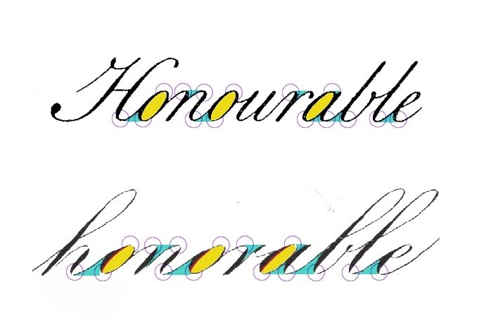
In studying different exemplars, I’ve decided to first take the approach of looking at them from a relatively zoomed-out point of view.
In this post, I list out the top three overarching qualities that a script generally follows. They are, in my opinion, contrast, harmony and symmetry. I propose that these are the top three key observable features that make one’s script beautiful and visually balanced, no matter which style of script you’re studying.
General Attributes
GA01 - Contrast
Contrast basically means to be distinctly different.
A basic example is how we vary the weight of the stroke. In Copperplate or Engrosser’s Script, there is a clear distinction between shades and hairlines (thick and thin strokes). In general, shades are found on the downstrokes and hairlines on the upstrokes. This is due to the design of the pointed nib; it is able to flex when pressure is applied.
Shades are created by applying pressure on the nib while moving it in a downward motion (downstroke). The pressure allows the tines of the nib to open up. The tines create grooves on the paper which set the boundaries of up to where the ink will flow.
Note that the nib isn’t designed to create shades in an upstroke, unless you rotate the pen in that direction.
Hairlines can be created in any direction as long as you don’t apply any pressure on the nib. The tines will remain closed and the ink will flow through the tip of the nib.
Accents - You’ll notice that loops may or may not have a dainty shade on the hairline when you study different exemplars of Engrosser’s Script. When the accent is present, its thickness is not as bold as the main shade, but it is distinct enough from the regular hairline to draw just the right amount of attention.
Accents can be made by pressing lightly on your nib, either while the drawing the loop downwards or if you had drawn the loop upwards, by going over it a second time.
Note that the transition between thick and thin is gradual. A hairline doesn’t immediately bulge into a shade and vice versa. Care and moderation needs to be exercised when applying and relieving pressure on your nib. Allowing the proper transition between contrasting thickness gives a sense of grace to your script.
GA02 - Harmony
I use the term harmony here to refer to the pleasing arrangement the components of your script take in relation to each other.
A couple of easy examples are
when the downstrokes lie on the same slant and are consequently parallel to each other and
when the upstrokes observe similar imaginary ovals and thus become nearly parallel to each other.
The placement and repeatability of similar strokes give out a sense of harmony in your script.
In this example, three out of four downstrokes in kl are parallel.
If you go back to Lupfer’s full a-z exemplar, you’ll find that k is the only letter containing a shade that obviously veers away from the general slant of his alphabet. Also, its length makes k taller than h. We can surmise that a couple of reasons for doing this are: to avoid clashing it with the loop and to improve legibility by distinguishing k from h enough from each other.
Even so, notice how the slant of the top shade relates to the slant of the hairline connecting k to l. Observe how the harmony is maintained in the negative space.
Study other variations of k and see how they may or may not harmonize with the rest of the letters.
Notice the harmony among the hairlines. The same right curve is carried over all of them.
Note, though, that the imaginary oval illustrated here is only one of many others that you may see or draw. The exact measurement of the oval itself does not matter; instead, pay attention to how close the upstrokes stay true to using the same curvature in the different parts of the letter. The oval is repeatedly implied across the script, resulting in harmony among the curves.
For l, you might notice that the bottom counter-space is narrower than that of the k. That’s because this was cut off from the a-z exemplar where the next letter is m, calling for a tighter turn. Even so, the harmony is preserved by the exit stroke not diverging too far away from the same exit used in k.
In the word common, harmony is maintained not only by having the same slant on all the downstrokes, but also by replicating the same left curves at the top turns and the same right curves at the bottom turns.
I think about left and right curves this way: if I divide the (imaginary oval) shape lengthwise and in half, does the curve lie to the right or to the left of the dividing line?
GA03 - Symmetry
Symmetry promotes balance in the script, and in a sense, also contributes to harmony. I’ve decided to separate it as the third general attribute so we can further identify where and how we can use symmetry to elevate our script.
Rotational Symmetry - The shapes stay the same when they’re rotated. In this script, most basic strokes have an equivalent when they’re rotated upside down (180 degrees).
Think of the underturn and overturn, as well as the upper loop and the lower loop.
Reflection Symmetry - One side mirrors the other when the shape is divided by a line.
For example, let’s disregard the shade and bisect an oval in half, lengthwise. The more symmetrical each part is to the other, the more balanced it looks.
There is another type of symmetry called Translational Symmetry, which basically means the shape is translated or moved from one place to another without rotating or reflecting it. This is reminiscent of our parallelism examples under harmony.
These three types of symmetry don’t necessarily have to be employed together all the time, every time. Depending on the letter or word, choose which type of symmetry that allows the script to look more consistent in your eyes. And don’t fret if it’s not exactly symmetrical. We have human hands and human eyes and our flaws are what makes our script interesting and unique.
What are other examples you can think of that exhibit these three general attributes? What opportunities for contrast, harmony, and symmetry do you see in your script? How are they utilized in the exemplars you are following? I encourage you to use these as goals to follow in your script and to see where they take you.
Letter Groups - Lowercase
I group the lowercase letters by the basic calligraphy strokes that they have in common.
REVIEW
Drawing letters (yay!) is the next step after familiarizing yourself with the basic strokes. If you want a review, here are the links:
Blog post: The Basic Strokes
Video playlist: YouTube Tutorials
Letter Groups
I know it could get pretty boring to just keep practicing the basic calligraphy strokes on their own; I think it helps a lot to know where you are actually going to be using these shades and hairlines on, so let’s get to it and put them to work!
I always like to group the letters of the alphabet by the common characteristics that they have. This way, I get to focus on their commonalities and make them consistent at the same time. It also helps my hand get in the zone.
I’ve collapsed the eight basic strokes from the previous lessons into six groups below, where the ovals and reverse ovals are combined into one group, and the lower and upper loops are together too. You may find some letters are listed multiple times. For example, letter p is listed both under the full pressure stroke and the compound curve. When you’re practicing, focus on what group it’s under to avoid getting overwhelmed.
p
d, t - As the extended stem of under turns
f, h, k, g, j, q, y - As part of the loop stem
i, u, w, a
d, t - With an extended stem
l, b - Connected with a loop stem
m, n, r
v, x, p, m, n, h, y
k, r - Smaller version or half turn
a, d, o, g, q - Regular oval
c, e, r - Half oval
x, s, z - Reverse oval
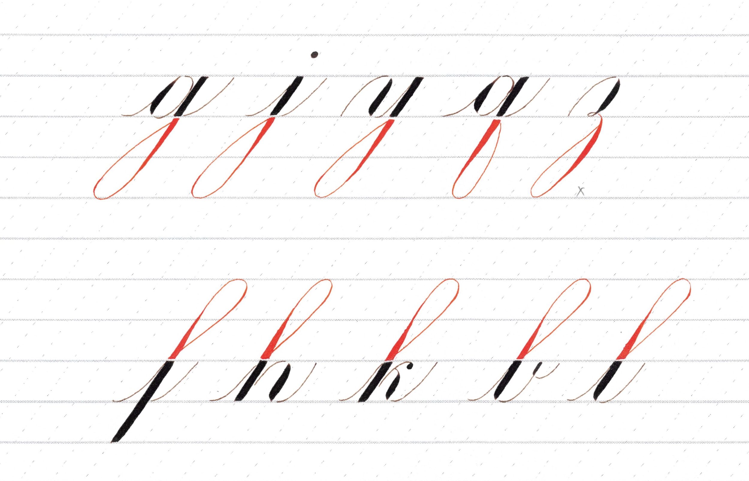
g, j, y - Lower loop
q, z - Lower loop with slightly different shape
f, h, k, b, l - Upper loop
In each of the photos below, I’d like to direct your attention to the parts that are drawn with vermillion ink (orange red).
I also drew each letter group twice: the first time with pen lifts each time the nib hits the baseline or the header line, the second time with just drawing each independent shape in one stroke. For example, an oval can either be drawn in two strokes or in one. You’ll notice tiny gaps at the top and at the bottom where I would stop and lift the pen to get ready for the next stroke (and I don’t mean the gaps between the different coloured inks here). It has a slightly different look too, when you lift versus when you don’t. Some people like lifting because you can get more precise strokes this way. Some people prefer the “flow” you get without any lifts. Try both ways and see which method gives you better results!
FULL PRESSURE STROKE
The full pressure stroke has an even width and it looks like a shaded parallelogram slanted at an angle. Try to keep the same heft not just for this stroke, but for all of your shades.
This stroke appears at least one x-height tall on letters with stems and loops (it could be longer or shorter depending on your preference), while it’s usually three x-heights tall on a standard letter p.
See how the upper stems of p, d, and t all hit the first ascender line, and the lower stems of f and p both hit the first descender line.
The letters above are executed with some pen lifts (e.g. for the letter d, I drew the oval in two strokes instead of one).
Note: I have a tiny cross mark on the first p above because I didn’t like how the first curve of the double turn stroke turned out (too narrow).
The letters above are executed with less pen lifts than the previous photo (e.g. for the letter d, I drew the oval in one stroke, but I would still lift the pen to do the stem next).
UNDER TURN
Try to make your curves the same each time you draw it on the baseline. For example, when you cover the top half of the letter a, the curve of your oval should be the same as the curve of your under turn.
Also, aim for even spacing. Notice how the space occupied by the oval in the letter a is roughly the same space occupied by the under turn.
Note that the eyelets for letters w and b should look the same and that they are located on the left of the hairline (or inside the under turn). The exit stroke of these two letters is just a tiny version of the exit stroke of your under turn.
The dot on the letter i ideally has the same heft as the shade of the under turn. Try to keep it aligned to the under turn too.
Each under turn above is broken down into two strokes: the shade and the hairline. See the gap at the baseline created by stopping and lifting the pen. Take care to still make it look like the corner of the shade continues to the hairline; unlike the letter l above. :)
Try to keep the curves symmetrical. Compare the letters i and d above; the exit stroke of d is a bit more open than the i’s.
Also try to keep the under turns as consistent as possible; it gets particularly obvious when there’s two in a row, haha! Look at my w above, the first under turn is a little off the slant so it looks different than the second under turn.
The under turns above are drawn in one stroke, without doing any lifts at the baseline.
Take care to ensure that the shade tapers off at around the same point for all your under turns. If you look closely at b above, the shade ended a little higher than it did for the letter l. Do as I say and not as I do :))
Also, the loop on l is bigger than b’s, but that’s okay; let’s focus on the under turns on this exercise and talk about the loops later.
OVER TURN
Each over turn above is broken down into two strokes: the hairline and the shade. See the gap at the header line created by stopping and lifting the pen.
Sorry for the flattish hairline curves for m and r; I struggle with that and definitely need more practice! :)
The over turns above are drawn in one stroke, without doing any lifts at the header line.
Take care to ensure that the shade starts off at around the same point for all your over turns. If you compare the two versions of r, the shade on the first one started a little bit sooner than the second r. Not enough to be noticed I think, but something to watch out for.
Also, ideally, when you rotate your over turns by 180 degrees, it looks like your under turns. That means that the transition point too, from thin to thick and vice versa, should mirror between your under and over turns.
COMPOUND CURVE / DOUBLE TURN
Now this shade is something I struggle with in terms of consistency, especially if I’m writing at a smaller x-height, because that would mean a shorter time to transition between thin to thick and back to thin again. But essentially, if you practice both under turns and over turns a lot, this compound curve should not be too hard for you. I apologize if my execution below aren’t the most consistent looking, but I hope they still serve their purpose, which is to illustrate similar letters! :)
Ideally, where the shade starts should look similar to where it starts for your over turns. Conversely, where the shade tapers off should be the same to where it does for your under turns. And, for balance, when you flip it upside down, you should see the transition points to be the same for both the top curve and bottom curve.
Notice how the size differs for the letters k and r because the stroke starts lower than the header line. These letters also don’t utilize the full double turn; only just about half of it.
The compound curves above are broken down into three strokes: the left curve, the shade, and the right curve. See the gaps created at the header line and baseline from lifting the pen at these points.
Watch the spacing; in the letter m above, I think I made the first half of the compound curve narrower if you compare it to the over turns.
Try to keep the width of the shade mostly even, except for where the curves occur at the top and at the bottom. It’s nice if you could keep the edges of the shade mostly straight and aligned with the slant. The shades on letters v and n look a little bottom heavy in the above example.
The compound curves above are drawn in one stroke, without taking breaks where the curves meet the header line and the baseline.
Where my shade starts at the top of the double turn aren’t particularly very strong in the above photo, can you see it? :)
OVALS - regular and reverse
Ah, the oval :) This is arguably the most important basic stroke to learn and get good at because it’s a key stroke in copperplate or engrosser’s script.
The curves of your over turn and under turns should match the curves of your oval. It follows that the width of your oval dictates the width of all your other basic strokes: under turns, over turns, double turns, reverse ovals, and the space inside the loop strokes.
In the following photos, the letters don’t necessarily have the full oval shape because the hairlines don’t always close the oval (like in c, e, r), but focus on how similar the shades are and the space the oval (or half oval) occupies in each letter.
I apologize if the shades look slightly thinner in this group than in the other groups. :) I did the batches in different days and I guess when I did this group I was feeling light handed! Ideally, keep your shades the same heft all through out the alphabet.
Note that the letters s, z, and x here use the reverse oval, where the shade in on the left side of your oval instead of the right, and you draw the shade clockwise instead of counterclockwise. I decided to draw them in the same group as the regular ovals to illustrate that they’re the same family, just upside down.
Look at the shades above and imagine being able to turn them into under turns by filling in the negative space at the top left. That’s one way of keeping your ovals and under turns consistent looking with each other too.
Conversely, imagine being able to turn your reverse ovals into over turns by filling in the negative space at the bottom right.
I find it easier to keep the inside edge of the shade straight when I do them with a pen lift, like in the above batch, versus doing the oval in one stroke, like in the below photo. Notice how the inside is more curved in the photo below compared to above. Both are fine as long as you choose the one that makes it consistent across all your letters.
You can decide how you want the shade to look like: do you want it to be evenly spread, or a little heavier at the bottom? In the above example, notice how the shade of r is a little bottom heavy compared to the letter o beside it.
I didn’t feel like I made a good s in the other groups, so I decided to do it solo here. Notice how the shade is a little top heavy. It’s better to do your reverse ovals top heavy if your regular ovals are bottom heavy.
Notice how the entry stroke is similar to the exit stroke. They curve the same way, approaching the 55-degree slant, and they look equidistant from each other.
Also, turn this upside down and it should resemble letter c! Although that hairline to the terminal dot could have been smoother.
Here’s another try at the reverse ovals for z and x. The bottom right curve of that shade for x could have been more graceful; I think I made it too straight.
LOOPS - Lower and Upper
Notice the teardrop shape inside the lower loops. If you rotate it 180 degrees, it should be the same as your upper loops.
Imagine bisecting the space inside the loop with a line that runs from the corner to the curve. It would be nice to have the curves symmetrical enough that you end up with two equal parts, like you’re able to “fold” it up nicely in half and the curves would fit.
Try to keep the same amount of space inside the loops, regardless of the letter it’s attached to.
A good rule of thumb is that the curve of your loop resembles the roundness of your oval. It follows that its width is congruent to an oval width too, but of course, you could decide to make it narrower for style purposes. I wouldn’t make it wider than an oval width though, because if you have consecutive loops, they’re going to overlap each other.
I penciled in a cross mark on the z above because I didn’t like how I closed the loop too soon. Notice the area inside the loop is a bit smaller than the others.
Try to keep your transition points at the same heights (where you switch from thin to thick or the other way around). See how high the shade ended for letter j above compared to the letters beside it (g and y). Ooh! And I just noticed that I forgot the exit stroke for the letter y above, sorry about that!
Another critique I have is that the b looks a little more bent forward than the rest because of the way the upper left curve went.
My l looks a little off slant in the above example. See how it’s bent forward compared to b.
Okay! I think this is a q I’m happier about compared to the other q’s I made in the group photos. Imagine flipping the loop to the left side (like a mirror image), you will get a g!
The letters q and z are the eccentric-looking ones in the group so I wanted to write them a few more times.
I drew z three times above; notice how the top portions are different. The first and last z both use reverse oval shapes, with the loop differentiating them, while the middle z uses an over turn.
I like to do the shade of the z once I passed the baseline so that when it’s time to draw the enclosing hairline of the loop and make it into an exit stroke, it crosses a hairline instead of a shade.
Bonus - Feedback
I hope you enjoyed this blog post! Feel free to use the letter groups I illustrated above in your own practice. You can also find them on Instagram with the #learnwithmaxie hashtag.
Basic Strokes - Lowercase
I go through the step-by-step process of how I personally execute the basic strokes that make up the lowercase alphabet.
Topics to Recall
Paper Position and Nib Alignment
Getting to Know Your Nib (Pressure and Angle)
About the Worksheets
My worksheets are heavily based on Engrosser’s Script (ES) as taught in The Zanerian Manual. At the time of creating these worksheets (October 2019), I was over a year in practicing ES using The Zanerian Manual as my standard, but three years in from first picking up the pointed pen. The worksheets were written by hand, scanned and digitized in a printable PDF format. There are flaws for sure, but they were the best I could produce at the time and I’m proud and happy to share them to anyone who can find it beneficial. As I progress and get better (as we all do with practice), I will probably go back and update them.
The guidelines I used on the worksheets have 8-millimeter spacing (x-height). It’s easier to learn with bigger spaces because you are able to spot errors better and the taller x-heights give you some time to think and transition the pressure you apply on your pen.
The slant lines are on a 55-degree angle, which is a common angle used for ES. You can choose a different angle, just make sure to stick to the same one as you practice.
2nd Ascender Line - the topmost line where upper loops of b, h, k, etc. can reach up to
1st Ascender Line - where the top of letters p and t reach up to
Header Line - where the top of letters like a, c, e, etc. reach up to
Baseline - where the bottom of letters like a, c, e, etc. sits on
1st Descender Line - where the bottom of the stem of p stops at
2nd Descender Line - the lowest line where lower loops of g, j, y, etc. can extend to
THE BASIC STROKES
Descending/Lower Loop - combined video below
1. FULL PRESSURE STROKE
Characteristics to aim for:
Top edge is straight and horizontal.
Shade has equal width from top to bottom.
Left and right sides are straight.
Left and right sides are parallel to each other.
Left and right sides fall along the 55-degree slant.
Bottom edge is straight and horizontal.
Four corners are pointed.
Basically, a shaded parallelogram!
When practicing, I suggest you pick one characteristic at a time and focus on getting that right before adding another.
For example:
First, focus on executing the shade as aligned to the 55-degree slant as possible. Recall Paper Position and Nib Alignment.
Next, practice getting even thickness. You do this by maintaining even pressure as you pull the pen downwards. Recall Getting to Know Your Nib (Pressure and Angle).
Practice in one space, two spaces, and three spaces (which is the actual number of spaces the stem of a standard letter p takes up).
Make sure you don’t get a shade that is too thick because the amount of shade you give here should ideally be the same amount you give to any other shade (on the other basic strokes like the shade of the oval, for example).
Then, check if the left and right sides of your shade are straight and not jagged. If they’re jagged, it could mean that your nib is not aligned to the 55-degree slant while you’re writing. Recall Paper Position and Nib Alignment.
Lastly, practice getting straight top and bottom edges (do top first, then bottom, or vice versa). This is the hardest part. Don’t worry if you don’t get it right the first time. It could take a lot of practice getting to know how the nib works and having it work for you. I have a method below that works for me currently; hopefully you’ll pick up a tip or two!
There are several ways to do this basic stroke. Here’s my personal take on it.
Step-by-Step Process:
Rest the right tine on the paper. Do this by turning the nib slightly to the right. Or if your pen holder is already set this way, there’s no need to turn your pen.
On this video, I show you what happens if I keep both tines resting on the paper and I apply even pressure to splay out both tines. Try it out for yourself. The top you produce would likely have a downward curve instead of a flat top. Or, if you are holding the pen too steeply, it could result in an upward curve.
You could also produce a flat top by turning the nib slightly to the left, but this one feels counter-intuitive (at least for me) because the nib would fall off the slant and I’d have to readjust it before doing the next step.
Some people also start by drawing a small horizontal hairline where you want your flat top to end up. When you do this before the rest of the steps, the ink will usually pool and stop at this hairline that you drew, thus creating that flat top.
2. While keeping the right tine in place, apply pressure to spread the left tine horizontally.
Depending on how you hold your pen, you may need to play with the angle of how high it is in relation to the paper to get a flat top that is straight and horizontal. In these photos, I compare the results of my holding the pen in a 45 degree angle from the paper versus a 60 degree angle. Try and see what it looks like for you!
3. With the nib aligned to the 55 degree slant (from top view) and the tines spread out, drag your pen downwards while applying even pressure.
Don’t rush between step 2 and step 3 because if you start pulling the pen downwards before you’ve completed the flat top, the top corners might turn out rounded instead of pointed.
4. When you are near the bottom line (depending on how many spaces you’re practicing with, it could be the baseline or 1st descender line), slowly release the right tine and let it meet the left tine while running it horizontally across the bottom line.
For some people, doing this quickly and snapping the nib back into place results in the desired flat bottom. For me, that usually results in a pointy corner that I would usually need to retouch to make it look like a flat bottom. I don’t mind retouching; it’s a smart thing to know how to do, but it’s definitely more efficient if I could do it in one motion.
Video Tutorial - Full Pressure Stroke
References
The Zanerian Manual has good drawings that show how the tines should look like while doing this basic stroke. There isn’t a lot of written instructions about this one but I found the visuals to be really helpful.
Dr. Joe Vitolo has lots of tutorial videos on copperplate script. Here’s his video of doing squared cutoffs that I think is very helpful too. He also talks about jagged edges in his book, Script in the Copperplate Style, which I found really interesting as getting jagged edges is something I do struggle with.
Special thanks to Nina Tran, who has helped me several times by answering questions on her live demos about how to get flat tops. She was the one who “cracked the code” for me when she taught about tine movement and holding the pen higher from the paper. Rotating the nib slightly to the right and changing the nib-to-paper angle were the tips that changed the game for me. Thank you, Nina! <3
2. UNDER TURN
Characteristics to aim for:
Let’s look at the shade first.
It has a flat top.
The left and right sides of the shade are mostly straight EXCEPT where the left side starts to curve near the bottom.
It follows that the shade has equal width except where it starts to curve.
It is on the 55 degree slant.
I personally prefer to look at the right side of the shade to confirm this, instead of the left, because of the way the left side curves and tapers. My shades are usually thick so I find it very obvious where the left and right side of the shade fall, but if you write thinner shades, it shouldn’t matter too much! (We can touch on this more when we get to the loops.)
The bottom left is curved and tapers smoothly to a pointed right corner.
The bottom right of the shade is pointy and lies straight along the slant OR could have a slight tail to the right where you’re making the turn.
Let’s look at it as a whole (U-shape).
The bottom curves mirror each other.
I imagine splitting the under turn in the middle and then when I “fold” it, the curves align neatly with each other.
AFTER doing the bottom curve, the hairline becomes a straight line that approaches the 55 degree slant.
It follows that the space between the shade and the hairline looks evenly spread, because both the shade and the hairline fall in the 55 degrees.
The width of the under turn should be roughly the same width of your oval (discussed later).
If you rotate your paper upside down, it should look the same as your over turn (discussed in the next section).
Step-by-Step Process:
If you notice, at least the first half of the shade is similar to the full pressure stroke. As such, the first few steps are the same steps you would need to replicate as if you were doing a full pressure stroke. If you have trouble staying on slant or keeping even heft, recall the notes from the previous section and remember to practice getting one characteristic at a time. Once you’ve got a handle on one characteristic, add another, and another, till you get the hang of the whole stroke.
Here’s my personal process. Try and see if if works for you.
Rest the right tine on the paper. If your pen holder isn’t set in a way that tilts the nib to the right, you may have to rotate your pen hold ever so slightly to the right.
While keeping the right tine in place, apply pressure to spread the left tine horizontally.
Pull your pen downwards while maintaining even pressure.
When you are approaching the baseline, start releasing the pressure while pulling towards the right. Take note of where you started releasing the pressure (let’s call this “transition point”) and use the same transition point for all your under turns.
Study how the left and right tines move. For this bottom turn, you would aim to move the right tine along a straight line along the 55 degree slant all throughout, but when you start releasing the pressure, the left tine should slowly glide to meet the right tine and create that curved left bottom and both tines should come to a point.
(Optional) Lift your pen at the baseline and adjust the placement of your hand on the paper to make sure your fingers have a comfortable range for creating the next stroke. I say this is optional because you should also try doing this without lifting in case you achieve better results! You just need to be mindful that you have enough range for the movement.
Starting where you left off at the bottom right corner of the shaded stroke (which is a pointed corner), begin a hairline with a curve that mirrors the curve of the shade.
Continue going upwards with a hairline that approaches the 55 degree slant, all the while maintaining a considerably even distance from the shaded stroke. Because the hairline is aiming for the 55 degree slant, it’s going to look parallel to your shade.
Make a note of this hairline because it will appear on almost all letters as the entry/exit stroke. (More on hairlines later.)
Practice with and without lifting. Practice two spaces high (16 mm) first then in one space (8 mm). When you’re practicing it in two spaces, it gives you time to think about where to transition from thick to thin. When you’ve gotten the hang of it, do it in one space because that’s going to be the actual height of your lowercase letters (x-height).
Video Tutorial - Under Turn Stroke
3. OVER TURN
Characteristics to aim for:
Let’s look at the shade on its own.
The top left is a pointed corner. It may lie along a straight line along the 55 degree slant OR it may have a slight tail where the turn is made.
The top right is a curve that begins from the pointed left corner and transitions to a straight line. It could have a shade right away OR it could start a short hairline prior to the shade.
The shade is on the 55 degree slant.
I personally prefer to look at the left side of the shade to confirm this, instead of looking at the right because that side of the shade starts with a curve. My shades are usually thick so I find it very obvious where the left and the right side of the shade fall, but if you write thinner shades, it shouldn’t matter too much! (We can touch on this more when we get to loops.)
Once past the curve, both the left and right side of the shade are straight and fall along the 55 degree slant.
It follows that the shade will have an even width after the curve and up to the baseline.
The bottom of the shade is flat.
Let’s look at the over turn as a whole.
The hairline starts from the bottom as a straight line that falls along the 55 degree slant. As it approaches the top, it forms a left curve.
Because most of the hairline and the shade are on the same slant, the space in between them looks evenly spread.
The width of the over turn should be roughly the same width of your oval (discussed later).
The curve of the shade (right curve) mirrors the curve of the hairline (left curve).
I imagine splitting the over turn in half lengthwise and “folding” it together. The image I want to get is that the curves align neatly with each other.
If you rotate your paper upside down, guess what you get? An under turn!
Step-by-Step Process:
Before you start writing, study the shape you are aiming to make. Note that the strokes of the over turn are typically done from left to right (the hairline first, then the shade, not the other way around).
Starting at the baseline, draw a straight hairline by moving your nib upwards along the slant.
When you are near the top, start curving slightly to the right.
Make a note of this hairline as you will see it again when we discuss entry strokes.
(Optional) Lift your pen once you reach the top and adjust the placement of your hand on the paper to make sure your fingers have a comfortable range for the next stroke.
Starting at your nib’s last position, slowly put pressure on the nib. Keep left tine on the slant while focusing on making the right tine do a curve. Aim for this right curve to mirror the left curve you’ve made with the hairline.
While keeping an even pressure on both tines, pull the pen downwards towards the baseline. Do this motion while keeping on slant.
The last step is the same way you would make a flat bottom for the full pressure stroke. One way is to release the right tine and let it glide along the baseline and meet the left tine.
Video Tutorial - Over Turn Stroke
4. COMPOUND CURVE / DOUBLE TURN
Characteristics to aim for:
Let’s look at the shade on its own.
The top part looks the same as your over turn.
Top left is a pointed corner.
Top right is a curve.
The shade lies along the 55 degree slant.
Middle portion (when you cut off the parts that curve) has an even width and resembles a full pressure stroke.
The bottom part looks the same as your under turn.
Bottom left is a curve.
Bottom right is a pointed corner.
Let’s look at it with the hairlines.
Hairlines are parallel or approach the 55 degree slant.
The hairline curves mirror the way the shade curves.
There is even spacing between the first hairline, the shade, and last hairline.
If the paper is rotated 180 degrees, the same exact shape should be seen.
Step-by-Step Process:
You’ll need to combine the movements you make for over turn and under turn to create this shape. I suggest getting the hang of these two first before jumping into doing the double turn.
Start exactly how you would draw an over turn.
Starting at the baseline, draw a straight hairline by moving your nib upwards along the slant.
When you are near the top, start curving slightly to the right.
(Optional) Lift your pen once you reach the top and adjust the placement of your hand on the paper to make sure your fingers have a comfortable range for the next stroke.
Starting at your nib’s last position, slowly put pressure on the nib. Keep left tine on the slant while focusing on making the right tine do a curve. Aim for this right curve to mirror the left curve you’ve made with the hairline.
Pull the pen downwards while keeping an even pressure on both tines.
The second part would be exactly how you would do an under turn.
When you are approaching the baseline, start releasing the pressure while pulling towards the right.
(Optional) Lift your pen at the baseline and adjust the placement of your hand on the paper to make sure your fingers have a comfortable range for creating the next stroke.
Starting where you left off at the bottom right corner of the shaded stroke (which is a pointed corner), begin a hairline with a curve that mirrors the curve of the shade.
Continue going upwards with a hairline that approaches the 55 degree slant, all the while maintaining a considerably even distance from the shaded stroke.
Video Tutorial - Compound Curve
5. OVAL
Characteristics to aim for:
The top starts with a hairline.
The top left is a big curve gradually easing from a hairline to a shade.
The shade could be bottom heavy OR could be evenly distributed, depending on your preference.
See how the right edge of the shade is almost a straight edge.
The end of the shaded stroke looks like how you curve your under turns.
The curves of the hairline mirror the shape of the shaded stroke.
Look at the negative space inside the oval and see if it is spread evenly.
Step-by-Step Process:
Here’s one way of drawing the oval.
Imagine where the center of your oval would be. Trace an imaginary line to the topmost guideline. This is a good starting point.
Start with a hairline then slowly put pressure on the nib while following a curved shape on the top left.
Reach full pressure by the time you are around the middle (or later if you want the shade to be bottom heavy). Keep the shade along the slant.
When you are nearing the baseline, slowly release pressure while making the bottom turn. Mimic how you would make your under turn.
(Optional) Lift your pen and adjust the placement of your hand on the paper to make sure your fingers have a comfortable range for the next stroke.
Starting at your nib’s last position, draw a curved hairline that mirrors the curved shape of the shaded stroke.
Continue with a hairline that approaches the 55 degree slant line.
End with a curve that meets your starting point.
Note that you could also do steps 6 to 8 backwards (start from the top to the bottom). You just need to make sure you don’t put any pressure on the nib to maintain the hairline. Experiment with whichever method you feel more comfortable with.
Also note that a lot of Engrosser’s Script exemplars have an accent or a slight shade at the top right of the oval, which could be added after you’ve completed the oval, or could naturally be done when you do steps 6 to 8 backwards and apply a slight shade while doing the right curve.
For the purposes of this blog post, we will focus on getting the basics down first, without any accent shades. I’ll make a post specifically for them in the future!
Video Tutorial - Oval
6. REVERSE OVAL
You execute the shade on a regular oval in a counterclockwise motion while on a reverse oval, your nib goes in a clockwise direction. The reverse oval is essentially your regular oval turned upside down! This means that if you prefer your regular ovals to have a bottom-heavy shade, then your reverse ovals should match them by having a top-heavy shade. This basic stroke is used in only a few letters: s, variations of x and z.
Characteristics to aim for:
Exactly how your oval’s shade would look like when you rotate it 180 degrees.
If your regular oval has a bottom-heavy shade, make your reverse ovals have a top-heavy shade.
If you like your shades to be evenly spread out and centred in the middle, that’s great too!
The left side of the shade is mostly straight and lies along the 55 degree slant.
The shade tapers to a hairline at the bottom.
Step-by-Step Process:
(For the shade only)
Start at the top like you’re about to do the shade of an over turn. Slowly put pressure on the nib. Keep the left tine on the slant while focusing on making the right tine do a curve.
Either put full pressure immediately or gradually, depending on whether you want your reverse oval shade to be top heavy or centred in the middle.
Gradually release pressure once you are past the middle
Taper off into a hairline while drawing the bottom curve.
Video Tutorial - Reverse Oval
7. DESCENDING/LOWER LOOPS
Characteristics to aim for:
Let’s look at the shaded stem.
It has a flat top resting on the header line.
The shade starts with an even shade aligned with the 55 degree slant, and it gradually thins out to a hairline that curves.
You decide where the transition point is; you could start thinning out the shade near the middle of the stem, or you could keep it pretty thick until you’re almost at the bottom, as long as you keep tapering off at the same point on letters with similar lower loops. And this transition point should be the same for your upper loops when turned upside down.
In this example, if you look at the left side of the shade, it’s pretty much straight and aligned with the 55 degree slant. The right side of the shade is the one that steers off of the 55 degree slant as the shade thins out and the curve bends. This is just one way of doing it.
You also decide how long you want the stem to be. You could draw it to hit the 2nd descender line like in the example, or end it somewhere between the 1st and 2nd descender line, or even just keep it short and end it at the 1st descender line-- as long as you keep its length consistent among your letters.
Let’s look at the enclosing loop.
The bottom curve of the loop resembles the bottom curve of a minuscule oval.
You decide how narrow or wide the bottom curve would be, but ideally, it wouldn’t exceed the width of your regular oval. This will make sense when you start writing words. Ideally, each letter occupies one unit of space that is usually based on the width of your regular oval. So if you have a word having consecutive loops that are wider than one unit of space, they’re going to overlap each other!
The hairline ends just below the baseline (where the hairline meets the shade).
Dr. Joe Vitolo has a wonderful explanation on this in his book, Script in the Copperplate Style. Basically, not ending the loop right at the baseline and instead leaving a gap underneath allows for a more graceful connection of this hairline when you draw its exit stroke, which starts right at the baseline and goes in an upward direction. If you end the loop right at the baseline and begin the exit stroke also right at the baseline, it looks a bit disconcerting because it would mean that the hairline “crossed” the shade in a horizontal line.
In some Engrosser’s Script exemplars, if you look closely, there is a slight shade on the hairline, right around the bottom left turn. You can naturally create this shade when you create the hairline from top to bottom. Otherwise, it can be added after the fact. This accent is optional, but the general reason for adding it is to give your loops a stronger and more balanced look, especially if the majority of the loop is a non-shaded hairline.
Let’s look at the negative space inside the loop itself.
It’s a long teardrop shape, with curves that are smooth and not jagged, and the space inside spreads out gradually and evenly.
If you bisect the loop in half with a line running from the upper corner to the middle of the bottom curve, you will end up with two equal-looking parts that you could imagine being able to fold nicely in half.
The loop ideally holds the same amount of space regardless of the letter it’s attached to.
Step-by-Step Process:
You could draw the lower loop in one stroke or you could break it in two strokes: the shaded stem and the enclosing hairline.
If you decide to break it in two, you also have the option of drawing the hairline either clockwise (bottom to top) or counterclockwise (top to bottom). Remember to keep your hand light if you draw it from top to bottom so that the enclosing loop is still a distinct hairline.
The steps below describe drawing it in one stroke. This is just one way of doing it; try the alternatives I mentioned above and see which way gives you the most desirable results.
Begin with how you would draw a full pressure stroke, which is with a flat top on the header line and a shade having an even width.
Gradually release the pressure at the point where you want the shade to start tapering off (your “transition point”).
Slowly pull your nib towards the left in order to draw the bottom curve.
Curve at the bottom like how your minuscule oval’s curve looks like.
Continue the hairline upwards while creating a teardrop shape. Meet the shade just below the baseline.
Click here to go back to the table of contents.
Proceed to the next section to watch the video for both lower and upper loops.
8. ASCENDING/UPPER LOOPS
Characteristics to aim for:
Let’s look at the shaded stem.
The stem starts with a curved hairline, and as it gradually thickens to full pressure, the shade becomes straight and aligned with the 55 degree slant.
You decide where you transition from thin to thick. It could be higher or lower than in the example, as long as you keep it consistent not only among your upper loops, but also among your lower loops when you look at them upside down.
In this example, if you compare the right side of the shade versus the left, the right edge stays on the 55 degree slant a little longer than the left, because the left is the one that curls in more dramatically to the right. This is just one way of doing it though.
The length of the ascending stem is also up to you. In the example, it hits up to the 2nd ascender line. You could keep it shorter than that, either only up to the 1st ascender line, or somewhere in between the 1st and 2nd ascender line.
The shade ends with a flat bottom.
Let’s look at the enclosing loop.
The top curve of the loop resembles the top curve of a minuscule oval.
This can be narrower or wider, but I suggest you don’t make it any wider than your regular oval because you might get overlapping loops when you have consecutive letters with upper loops.
If you look at where the hairline meets the shade, I left a tiny bit of a gap there. When you have an entry stroke for your letter (which would look like a hairline starting from the baseline and ending right at the header line), the gap will make it look like you created the hairline in one continuous stroke.
In some Engrosser’s Script exemplars, you’ll notice a slight shade near the top right of the loop. This shade could organically be drawn when you execute the loop from top to bottom or could be added as an accent after drawing the hairline first.
Let’s look at the negative space inside the loop itself.
Turn it upside down-- it should look like a long teardrop shape, exactly how the negative space of your lower loops look like.
If you bisect the loop’s area in half with an imaginary line running from the end of the loop going up to the top curve, ideally, you should end up with two equal parts that you could imagine can be folded on top of each other.
The inside of the loop ideally holds the same amount of space regardless of the letter it’s attached to.
Step-by-Step Process:
You could draw the upper loop in one stroke or you could break it in two strokes: the shaded stem and the enclosing hairline.
If you decide to break it in two, you also have the option of drawing the hairline either clockwise (top to bottom) or counterclockwise (bottom to top). Remember to keep your hand light if you draw it from top to bottom so that the enclosing loop is still a distinct hairline.
The steps below describe drawing it in two strokes: shaded stem first, enclosing loop second, that is drawn from top to bottom and without applying any pressure. This is just one way of doing it; try other ways and see which one suits you. You could even try rotating your paper upside down and doing a lower loop in place of an upper loop!
Start with a hairline that slightly curves on the left. This curve resembles the top left curve of your minuscule oval.
Slowly pull your pen downwards while keeping it aligned on the 55-degree slant and gradually put pressure on the nib.
Reach full pressure once you are past the transition point. This should be the same transition point as your lower loops’ turned upside down.
Maintain even width till you reach the baseline and end the shade with a squared bottom.
Go back to the top of the stem and draw a right hairline curve in a way that resembles the curve of a minuscule oval.
Instead of closing it like an oval, continue drawing the hairline downwards, keeping in mind an upside-down teardrop shape. Meet the shade just above the header line, leaving a tiny gap.
Video Tutorial - Lower and Upper Loops
Last Words!
Getting good at calligraphy requires sheets and sheets of paper, and hours and hours of both studying and practicing :) The more you write and practice, the more you will get better at it. Have patience; learning any new skill takes time!
I would encourage you to especially take your time learning the basic strokes because they’re the very foundation of the script. In my opinion (and I’ve been there), if you jump straight to writing without a thorough understanding of the basics, you might find your outputs lacking and your script missing a ‘unified’ look.
Aside from training the muscle memory of your writing hand, also train your eyes by looking at different calligraphy exemplars and scrutinizing what you like and don’t like about them. You can then start incorporating the things you like into your own calligraphy script.
Take a look at these wonderful resources:
Getting to Know Your Nib
Knowing how your tool works is one of the most fundamental things you need to do before jumping straight to writing words and letters. Let’s talk about how a pointed nib works in creating shades and hairlines. Let’s also go over some nib exercises that will get your muscle memory used to how your nib behaves.
A pointed nib has a slit running vertically across the middle, splitting it into two tines.
When you write without putting any pressure on the nib, the stroke that you’ll produce is a thin stroke, often called a hairline. You can create a hairline whether you are writing in an upward motion (upstroke) or a downward motion (downstroke).
When you put pressure on the nib, the two tines will splay out, revealing a gap in the middle where the ink will flow to form a shade. Note that the natural way you are able to move the pen while applying pressure is downwards. The pointed pen isn’t made for creating shades using an upstroke.
Note as well that nibs have different levels of flexibility on them. Nibs like Nikko G require a heavier pressure to create a shade while Hunt 101 needs only a gentle prompt and the tines are easy to separate.
Notice that the two tines are sharp enough to make grooves on the paper. Try this without ink first: apply a gentle pressure on the nib to separate the tines and then move your pen downwards. If you look closely, the two tines will have created a gutter-like indentation on the paper. Now try this with ink and you’ll see that the ink will flow onto the paper and stop at the gutters you’ve made.
Downstroke + pressure = shade
Downstroke (no pressure) = hairline
Upstroke (no pressure) = hairline
Upstroke + pressure = don’t do it. :) You’ll ruin the nib!
Here are some exercise ideas for you to get familiar with your nib. Remember to try to keep the nib parallel to the slant lines (55 degrees for copperplate) while you are writing.
Write hairlines using an upstroke, then using a downstroke. Get a feel of how smoothly the nib glides onto the paper.
Play around with how steep you hold your pen in relation to the paper. Feel how much resistance you get when you raise your nib high from the paper versus when you put it lower and closer to the paper. This resistance is more obvious when doing upstrokes.
Put pressure on the nib and create vertical shades. Try to maintain even pressure as you go down a couple of spaces. Remember to align your nib to the slant lines so that the vertical edges of your shade are smooth.
Do another shade. Apply more pressure, then apply less. Try to get a feel for what amount of pressure you are most comfortable with. It comes with time and practice, but in order to produce consistent-looking letters, it is important that you know how heavy or how light your hand tends to write with a pointed pen, and that you maintain that same pressure as you write. You’ll also need to consider the height of your letters when deciding on the heft of your shades. For example, it’s a bit difficult to do thicker shades on smaller sizes.
Create wedge-shaped shades by starting with a full pressure and then gradually relieving it to a point. Do the opposite by starting with a point and applying full pressure.
Do some swirls, ovals, loops, or any fun shape you want. Put pressure whenever you’re doing a downstroke and let the nib glide when you’re doing an upstroke. Watch your transitions from shades to hairlines, and then back again. Try to keep the transitions as smooth as possible by gradually putting and lifting pressure as you go.
Whenever you write something that crosses or touches an existing stroke, watch how the ink interacts with what you’ve already written. If it’s a hairline with a hairline, it’s usually fine. If it’s a shade touching a hairline, it’s also usually fine. But notice when it’s a hairline crossing a shade, there’s a tendency for part of the hairline to get thicker right after it intersects the shade, usually when a fiber is dragged along. Notice too when a shade touches another shade that’s still wet, the ink will pool together and it does not look good.
As you practice, pay attention to the vent hole of your nib. The more you write, run out of ink, and re-dip your nib, the more you will get into the rhythm of it that you wouldn’t even need to look at the underside of your nib to tell that it’s time to dip again!
Cleaning Nibs and Checking for Damage
On this post, we go over how to clean a new nib, how to tell if it’s good to go, and how to tell if it’s time to replace it.
How to clean a new nib:
If you dip a new nib in ink and try to write with it, chances are, you’ll struggle producing proper strokes! This is because nibs have manufacturer oils coated on them that prevent them from rusting, and guess what, these oils are also going to prevent the ink from sticking to the nibs and flowing properly off of them, unless you clean them first.
Here are some options on how you can prepare new nibs for use.
Wash it with dish soap and water.
Wipe it with rubbing alcohol.
Put toothpaste on a Q-tip and wipe it off gently.
This is icky but other people do it: spit on a paper towel and wipe the nib with saliva.
Very, very carefully stick the nib in a potato for a few minutes. And I say “very” twice because if you do this wrong, the tines are going to get damaged and won’t spring back to its correct position.
Note: While writing, it’s good practice to regularly clean the nib by dipping it into a jar of water every few lines and every time you end a session, especially if you’re using metallic or sumi inks (which tend to dry faster and stick to the nib) or if you’re using a paper that has fibers that tend to catch on your nib often.
What does a properly cleaned nib look like?
When you dip it into ink and look at the underside, the surface that touched the ink should be fully covered with no spots peeking out.
How to check for damage:
There is a slit that splits the pointed nib into two tines. View the nib from the side and from the top. These two tines should be perfectly aligned with each other; there should be no gap.
With the curved side up, hold the tip against your fingernail or a piece of paper and gently put pressure on it. The two tines should splay out, and when you release the pressure, they should snap back to its starting position and in perfect alignment.
Sometimes the damage is imperceptible and you will only feel it when you write. When you are writing upstrokes and one of the tines gets left behind, therefore the nib skips the paper, it’s time to replace the nib.
Pen Holders and Nib Angle
This post takes a closer look at the important angles an oblique pen holder has upon itself and relative to the paper, plus how it usually affects your writing.
When doing pointed pen calligraphy, the main tools that you need are:
Pen holder
Pointed nib
Ink
Paper
It is also useful to have a jar of water for rinsing the nib and paper towel or a piece of cloth for wiping the nib. You would want to clean off your nib after every session, whenever you get paper fibers stuck in it, or whenever the ink has dried on the nib.
There are two types of pen holders: straight and oblique.
The straight pen has a groove at the top where you can insert the nib into. I would recommend using a straight pen if you want to do a vertical script (not slanted at all). I personally have trouble using the straight pen for a slanted script like copperplate because I find that I would have to twist my hand uncomfortably to do it, but different people hold pens differently so I would still encourage you to try using it.
The oblique pen has a metal attachment to the pen called a flange. The metal flange protrudes at an angle from the pen holder and is meant to assist you in performing a slanted script.
When buying oblique pens, I would advise you to pay attention to how much the flange allows the nib to be angled towards the center of the pen. If you trace an imaginary vertical line from the center of the pen, the tip of the nib should fall as close as possible to that imaginary line. Having it aligned to the center allows for a more balanced feel while writing.
Another thing that I would look at when writing with oblique pens is the angle of the nib relative to the paper. Everyone has their own preference on this and you would develop your own preference the more you use the tool. Here are some differences that I’ve noticed:
Steeper nib-to-paper angle:
There is more resistance in splaying the tines of the nib
Shades tend to be naturally thinner
If you want shades to be thicker, you need to apply more pressure
Thinner and crisper hairlines
Paper tends to snag more
Scratchy writing
Personally, it is easier for me to create squared tops with a steeper angle
Lower nib-to-paper angle:
There is less resistance in splaying the tines
Easy to create thick shades
Less pressure needed
Hairlines can get thicker
Nib catches less fibers
Smoother writing
Hope this post helps you get to know your pen holders a bit better!
Paper Position and Nib Alignment
On this post, I talk about how to position the paper on the table before and while writing calligraphy. Key points are finding your natural finger movement, aligning your nib to the slant lines, and keeping the range of your hand right on your sweet spot on the paper.
People usually just want to jump into writing when handed the tools (I’ve been guilty of this myself!) but I wanted to first share with you how I usually position my tools and myself relative to the table prior to actually doing calligraphy. The way I do this has changed over the years and I won’t be surprised if it will still change in the future, but I have some pointers that might be helpful for you to try and see if it benefits you in some way. I don’t think there is a right and wrong way to do this, but these steps hopefully will make you more comfortable while writing, because calligraphy is a slow art and body aches and hand cramps are not unheard of :)
What you’ll need:
Paper with 55 degree guidelines printed on them (8mm guidesheet)
Pen holder with a pointed nib inserted to it
Clear table
Comfortable chair
Start with a clear table with your tools ready on the side. Take a seat and let’s do this!
Rest your writing arm comfortably on the table. Place your forearm in front of you with your elbow off of the table but near the edge.
Hold the pen in your writing hand as if you are about to write. Keep your wrist relaxed; don’t bend or twist your hand away from your forearm.
Note: How you would normally hold ANY pen is a good starting point. If you’re a beginner, I wouldn’t want you to worry about pen grip just yet :)
When you’ve more or less gotten to know how a nib behaves and if you find that you grip the pen too tight, resulting in hand cramps, I would advise you to gradually adjust your pen grip a little each time you practice, until you find a grip that doesn’t cramp your hand as much. While I believe there is no right or wrong way to hold a pen, if you want to adjust your death grip, try googling “dynamic tripod grasp” and aim for that pen hold.
While holding the pen and without any paper underneath it yet, imagine that you are writing a straight line. You’ll see your natural finger movement by moving the pointed nib in an up and down motion with just your fingers driving the pen.
This is one of the many things that I learned from Nina Tran. She’s a wonderful teacher and hosts a live Q&A every week on her Instagram page.
Now, while keeping an eye on the angle of your imaginary lines, place the paper under the nib in such a way that the slant lines are aligned with the movement of your nib.
The paper will most likely end up being aligned to your forearm and rotated quite a few degrees to the left if you are right handed (and to the right if you are a lefty).
This is important not just to make your hand comfortable but also to make your nib last longer. Twisting your wrist while writing cramps your hand much faster and dragging the nib in an unnatural angle puts uneven pressure on the tines, decreasing its life as well as producing jagged edges in your calligraphy.
Note: While you are doing calligraphy, you will find that there is a spot where your hand is able to write comfortably and your fingers and wrist don’t have to strain and reach too far. Take note of that ‘sweet spot’. Instead of moving your hand along the paper from the leftmost to the rightmost side of the paper, adjust the paper underneath your hand and keep writing on that sweet spot. This reduces hand cramping and also helps produce consistent letters.
Optional: If you find that your elbow gets tucked closer to your body while your writing and that the majority of your forearm is hanging off of the table, causing it to feel numb after a while, you can try twisting your seat so that your body is facing slightly to the left until your whole forearm rests comfortably on the table.
Now what do you do with your non-writing hand? Use it to hold down or pin the paper gently onto the table. This is because you might find your paper sliding down with the pressure you’ll be applying to the pen when you’re dragging it downwards.
Our hands have natural oils on them that could interfere with how the ink sticks to the paper. And I get sweaty hands as well! So it’s useful to have a separate guard sheet placed under your writing hand. Just be careful not to let it get in the way of your writing.
As for your posture, you will most likely lean forward towards the paper in order to see what you’re writing. Try to keep your back straight and try not to slouch. When you lean forward, bend from your hips and not from your back, neck, or shoulders.
Lastly, don’t forget to breathe! There’s a tendency to hold your breath while writing. Remind yourself to inhale (try this with each upstroke) and to exhale (try this with each downstroke).
For more tips on breathing and posture, look up Paul Antonio’s videos on Youtube. I’ve certainly taken some of his techniques (#s 5, 8, and 9) and adjusted them to my own comfort.
Hope this helps!
How to Write Calligraphy on Marble
My tips on how to write pointed pen calligraphy on marble coasters. I talk about the tools I usually use, how to erase mistakes, and how to make sure the ink stays on the marble for longer.
I’ve written on marble coasters for gifts, for a wedding, and just for myself and I have to say it’s one of my favourite projects because they’re simple and they look quite special when personalized.
Read on for the process that I usually follow and I hope you pick up some useful tips!
Wipe the marble surface with a glass cleaner before starting. This makes sure that the ink doesn’t go all over the place when you start writing.
To achieve thicker strokes, use a flexible nib like the Hunt 22B, Hunt 101, or Brause Blue Pumpkin. Take note, if you are not used to a flexible nib, the ink might be harder to control and the thickness can get out of hand.
If you don’t mind having less contrast between the thick and thin strokes, stiff nibs like the Nikko G and Zebra G are sturdy and work well with marble too. You might have to retouch the upstrokes to achieve more visible lines at times.
Not all marbles are smooth. If you visibly see pores on its surface, it’s better to use thick inks like Dr PH Martins Iridescent Ink. Added bonus: this ink is waterproof. If the surface is smooth enough, it can take thinner inks like sumi ink.
If you make a mistake and the ink is still wet, wipe it down with a paper towel dipped in clean water. If the ink has dried a bit, rubbing alcohol works great. Use a Q-tip for spot correction or paper towel for wiping the whole thing away. Just make sure that the surface is dry before writing on it again.
Let the ink dry for 24 hours. Spray a fixative (I use Krylon) as many times as you desire to make sure that the ink stays longer.
Watch the following video to see how I wrote on these marble coasters using a jade calligraphy ink from Dr. PH Martins Iridescent collection.
Hope this helps!